
The process:
I started by exploring possible user interactions with the three physical buttons located below the screen. I wanted to use similar UX patterns that I already established with Zebra smart devices. That's why I kept the colors and typeface same but being a non-Android device meant that I had to custom design some components to distinguish this from other Android devices in our portfolio. The low pixel density and low refresh rates on the screen meant the interaction needed to be direct and free from any visual effects. I looked back at old GSM phones for inspiration and explored their menu systems to start my research.
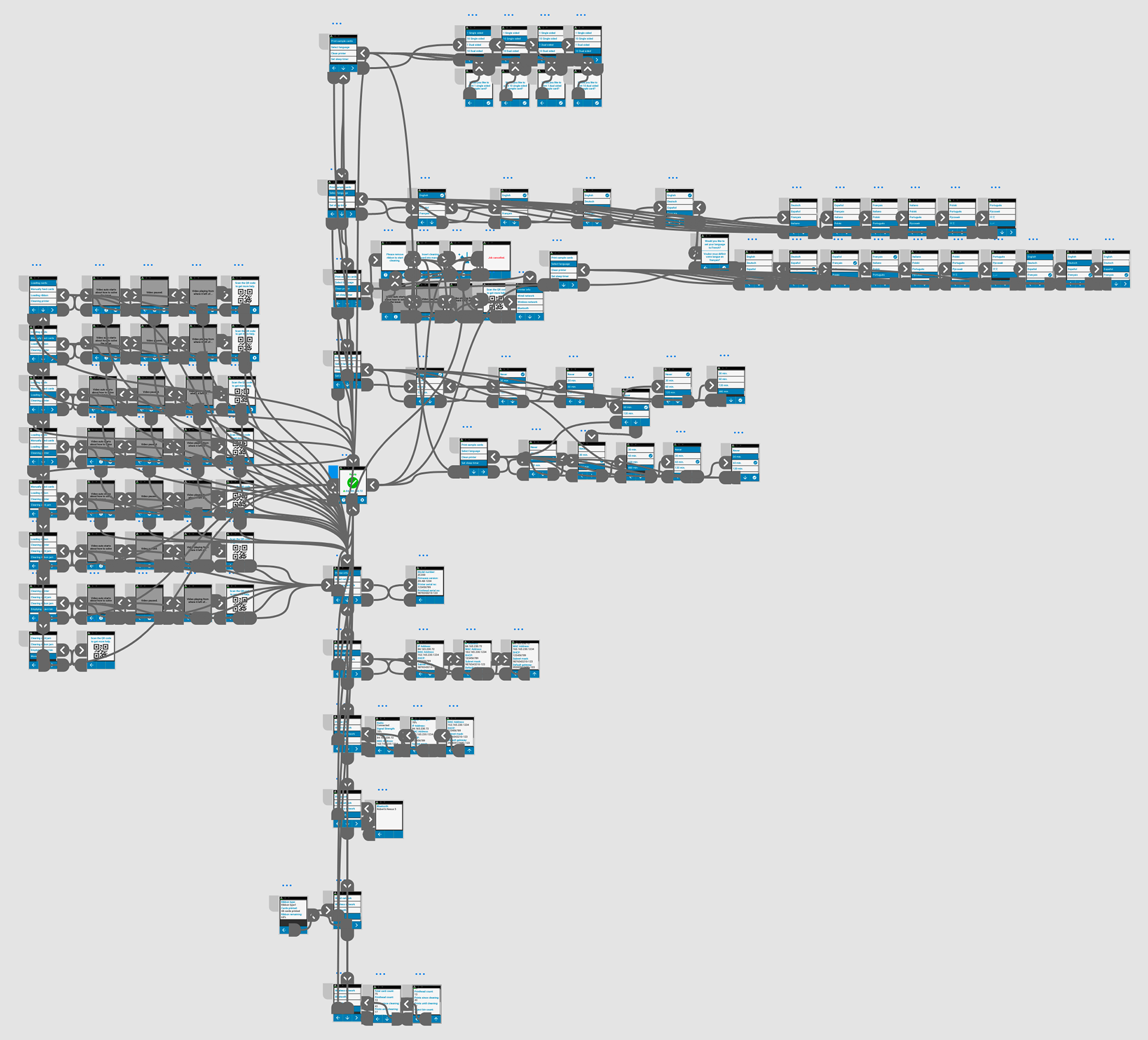
With many experiments to find the balance for the right text size and contrast ratio, I began to develop the menu system. On each iteration, we tested the UI and asked for feedback from our end users. The menu navigation and interactions were shaped based on this research made by our research team.
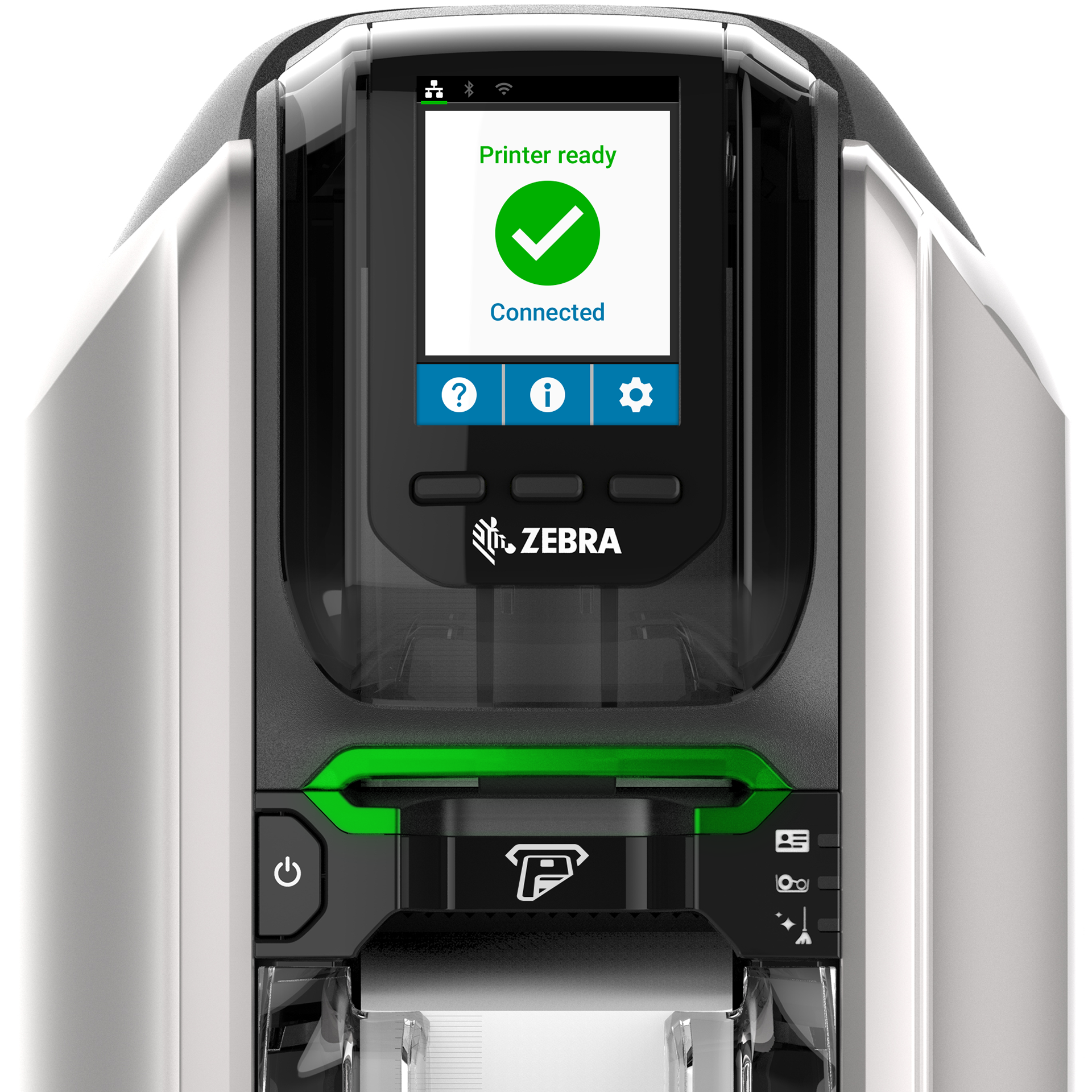
On the UI, I wanted to welcome the users with a big green check mark to show that the printer was ready for action as soon as they turn on the device. This approach was different than what we previously had but it was well received by our users.
Please check this link for the interactive prototype created in InVision to see the printer menu in action.
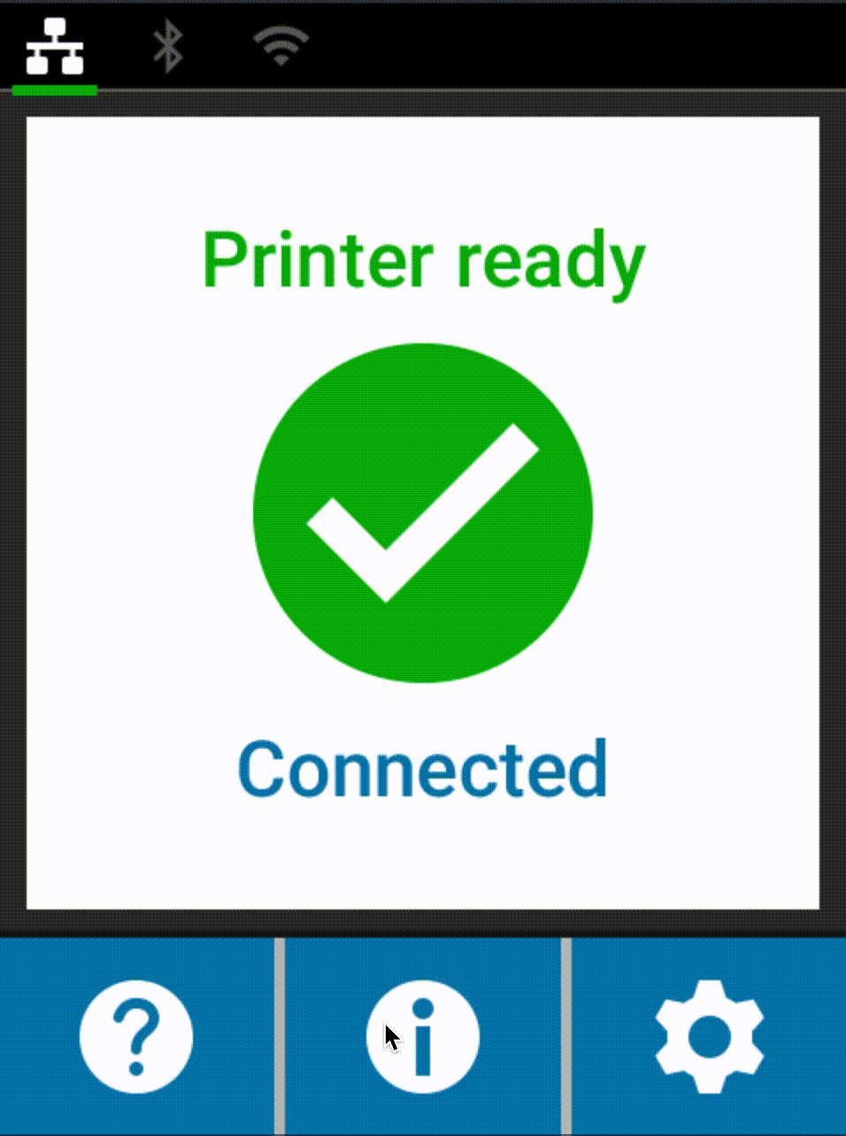
Having three physical buttons for interaction was limiting so I created contextual menus and icons that changed each time user interacted with one of the buttons. I custom designed components, UI assets and icons for the menu system. I used Adobe XD for creating the prototypes.
Easier troubleshooting was also heavily requested by our end users so we put basic 3D animations to explain how to solve common issues with the printer.
The impact:
This printer has become the fastest selling card printer in Zebra history and put Zebra into the top 3 card printer manufacturers in the world. The UX and UI I did on this printer was critical to this success.
This is the promotional video for the printer.
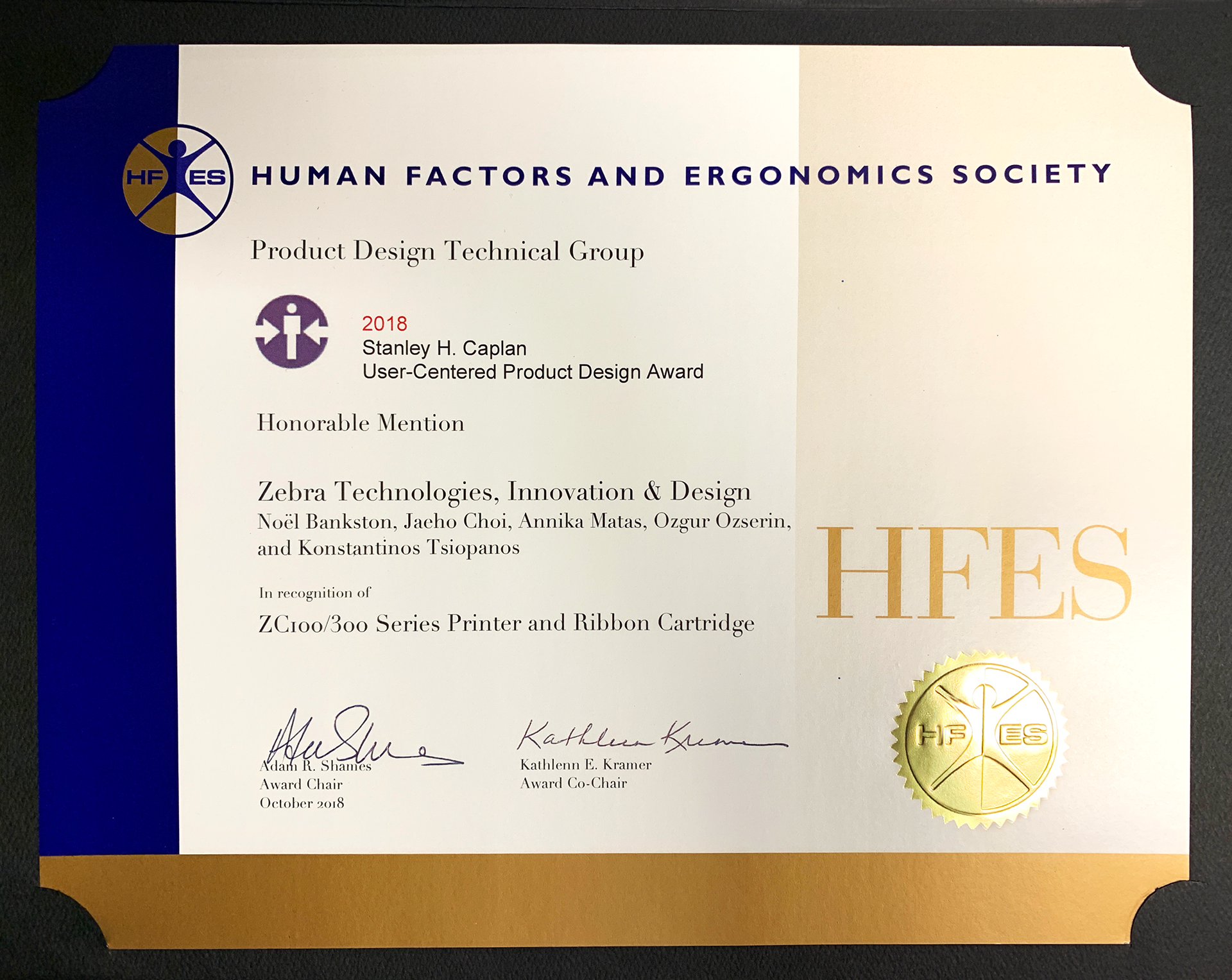
Our award by HFES