
The problem:
The previous icon library included a mix of 2D and 3D styles, various icons from different sources making it impossible to have a "family" feel.
The solution:
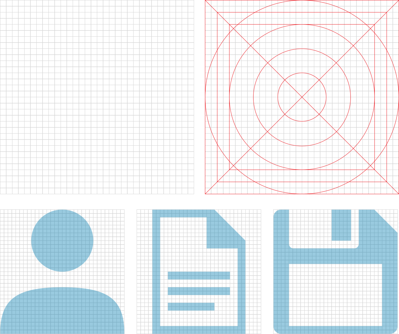
I created a 32x32 grid and chose frontal 2D look approach to bring an order and consistency to the library. I set up some rules, like line weight and the corner radius values to strengthen the identity. Each icon is reduced to its minimal form with every idea distilled to its essence. This ensures clarity even at small sizes increasing the visual appeal and impact of each icon.

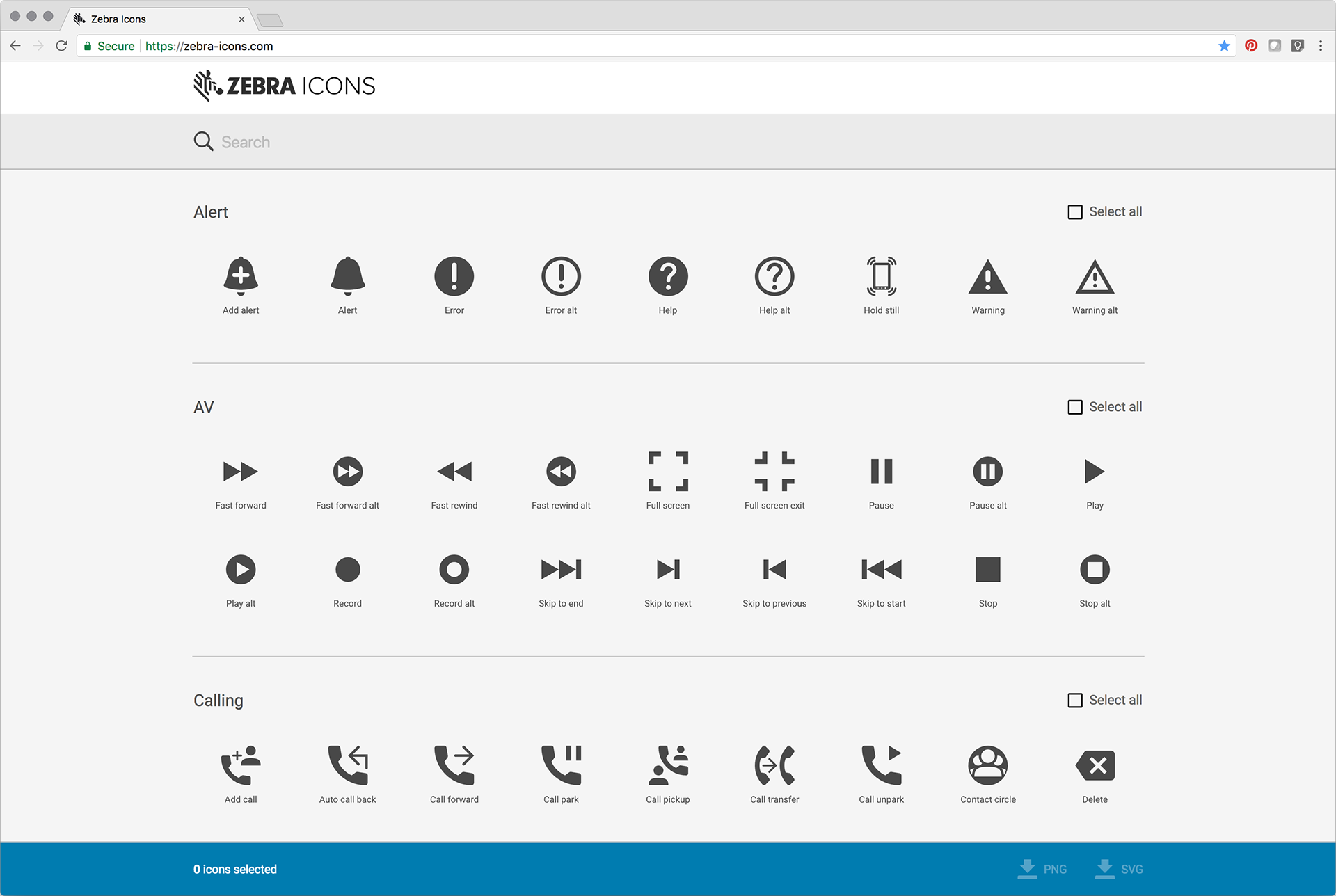
All icons are uploaded to a web page for easy access.
The impact:
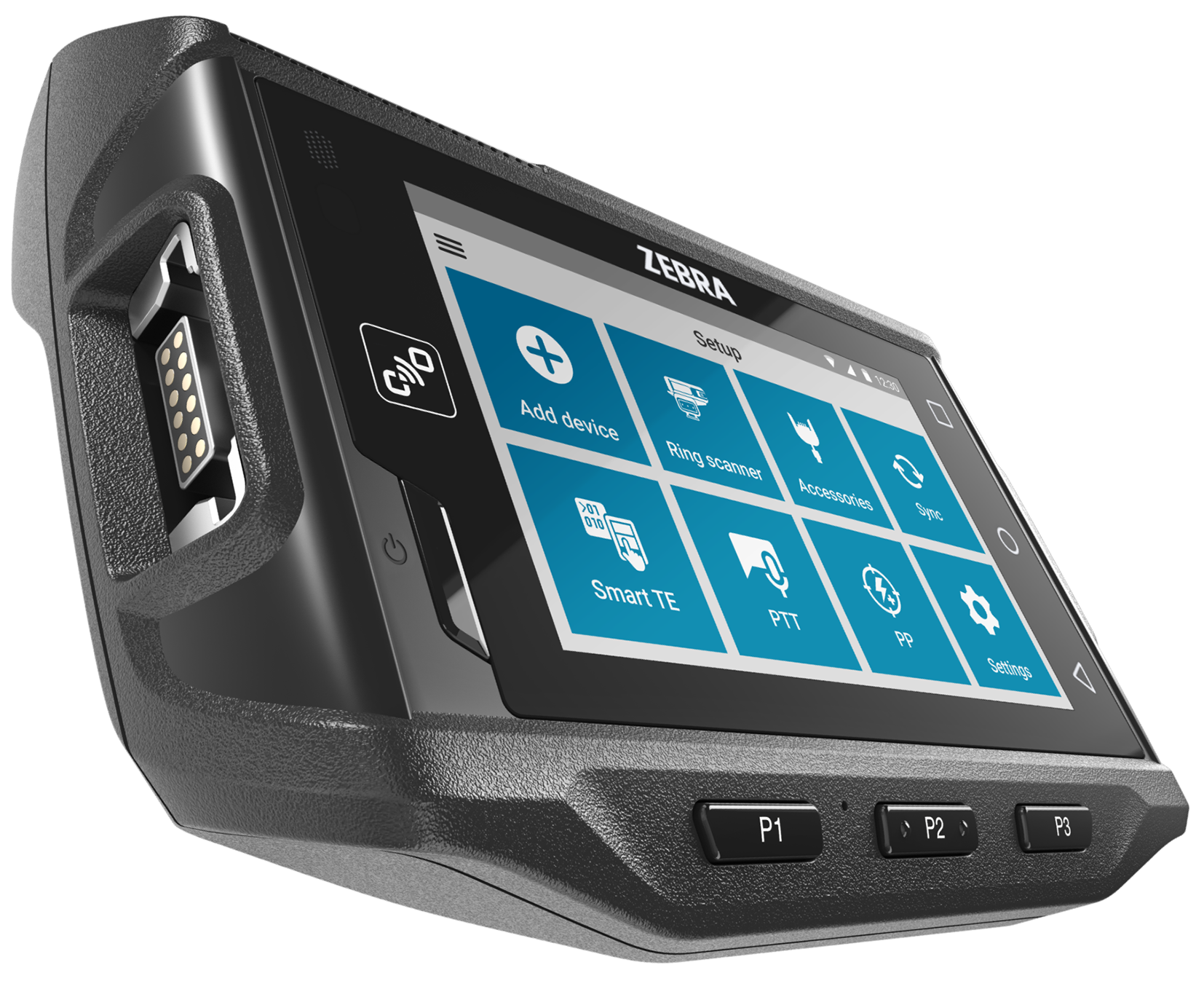
The icon library is now widely used across Zebra, from hardware to software solutions both internally and externally, ensuring consistent look and feel for the brand.
The story:
Please read my Medium story to learn more about this icon library.