Next generation:
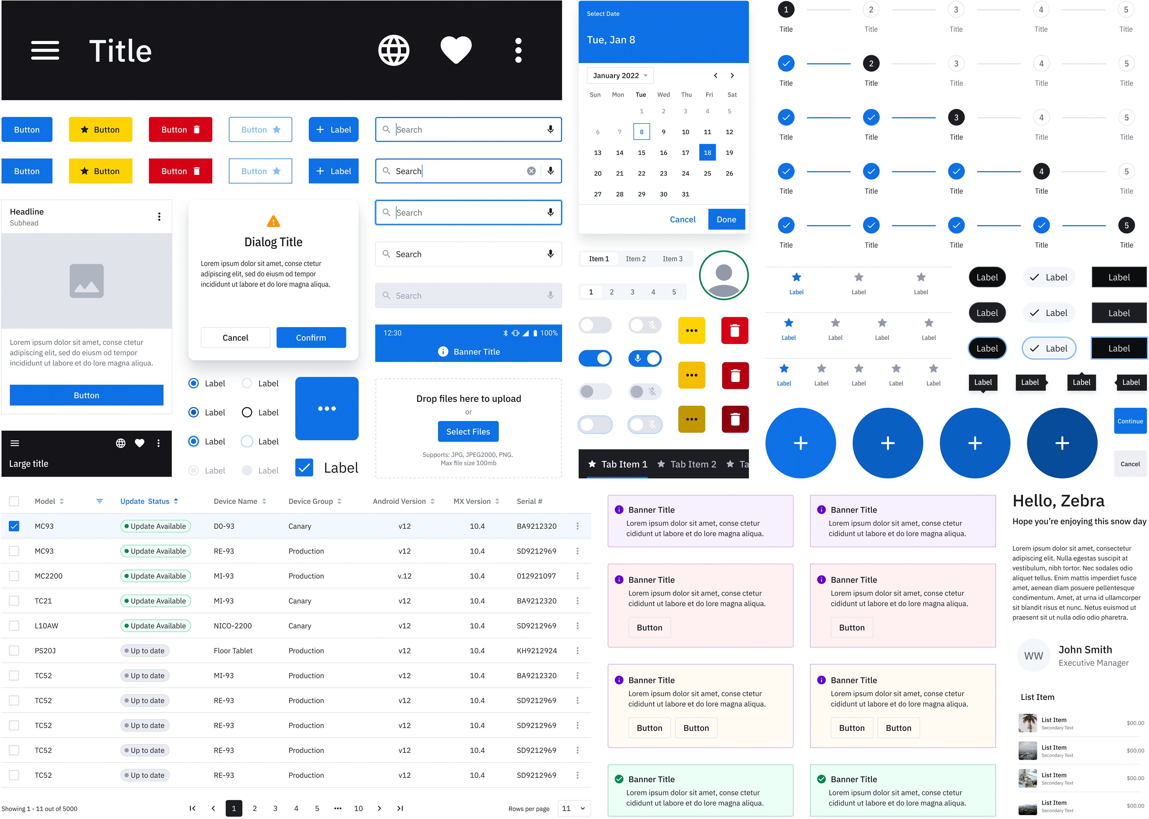
Zebra Design System v2 is the next step in building easy to use solutions for enterprise. Following the principles set in v1, this new version aims to cover a wider range of users and edge cases. I added new components and more variants to meet the demands of a modern work force using newer technologies, such as wearables and AR devices whilst keeping the focus on efficiency.
Moving to Figma:
The previous version was created in Sketch and it was enough for the time it was made, but with Figma's tools for creating and collaboration in between designers convinced us to make the switch. This was a good opportunity to revisit many of the old components and see if they were still answering the needs of our end users. With closer inspection on the v1, it was clear that we needed a bigger, more comprehensive set of components and tools designed from the ground up rather than a redesign.
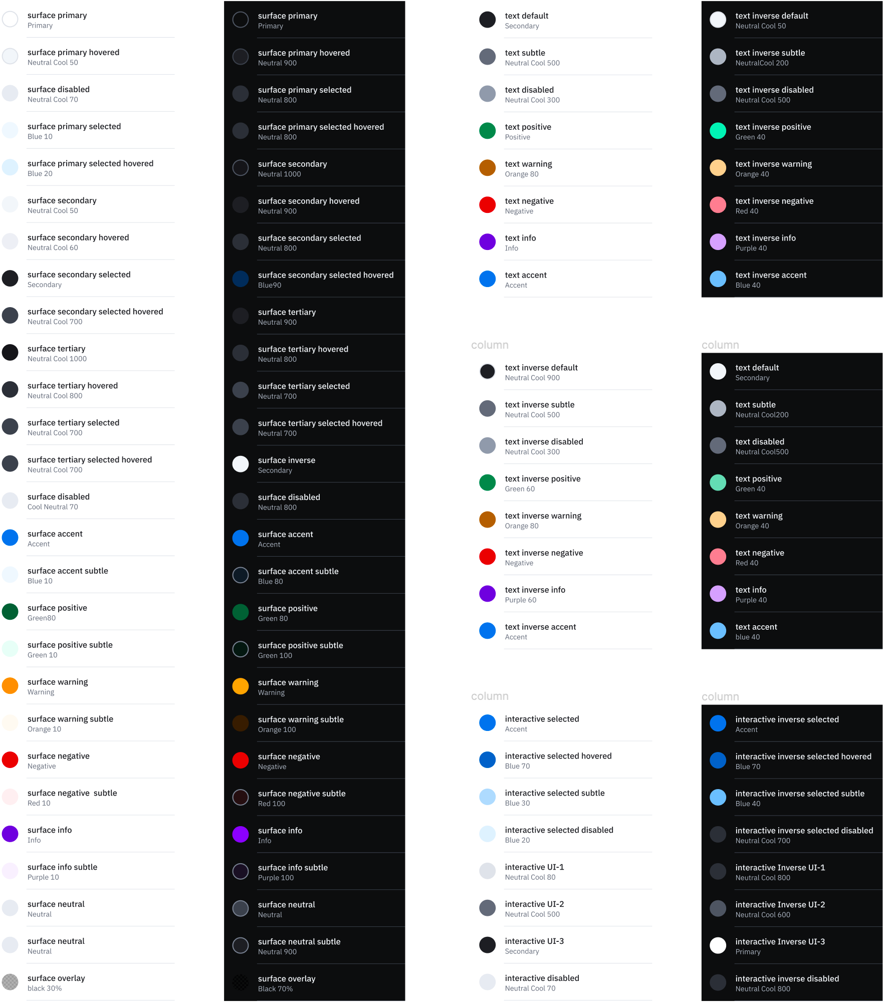
Colors :
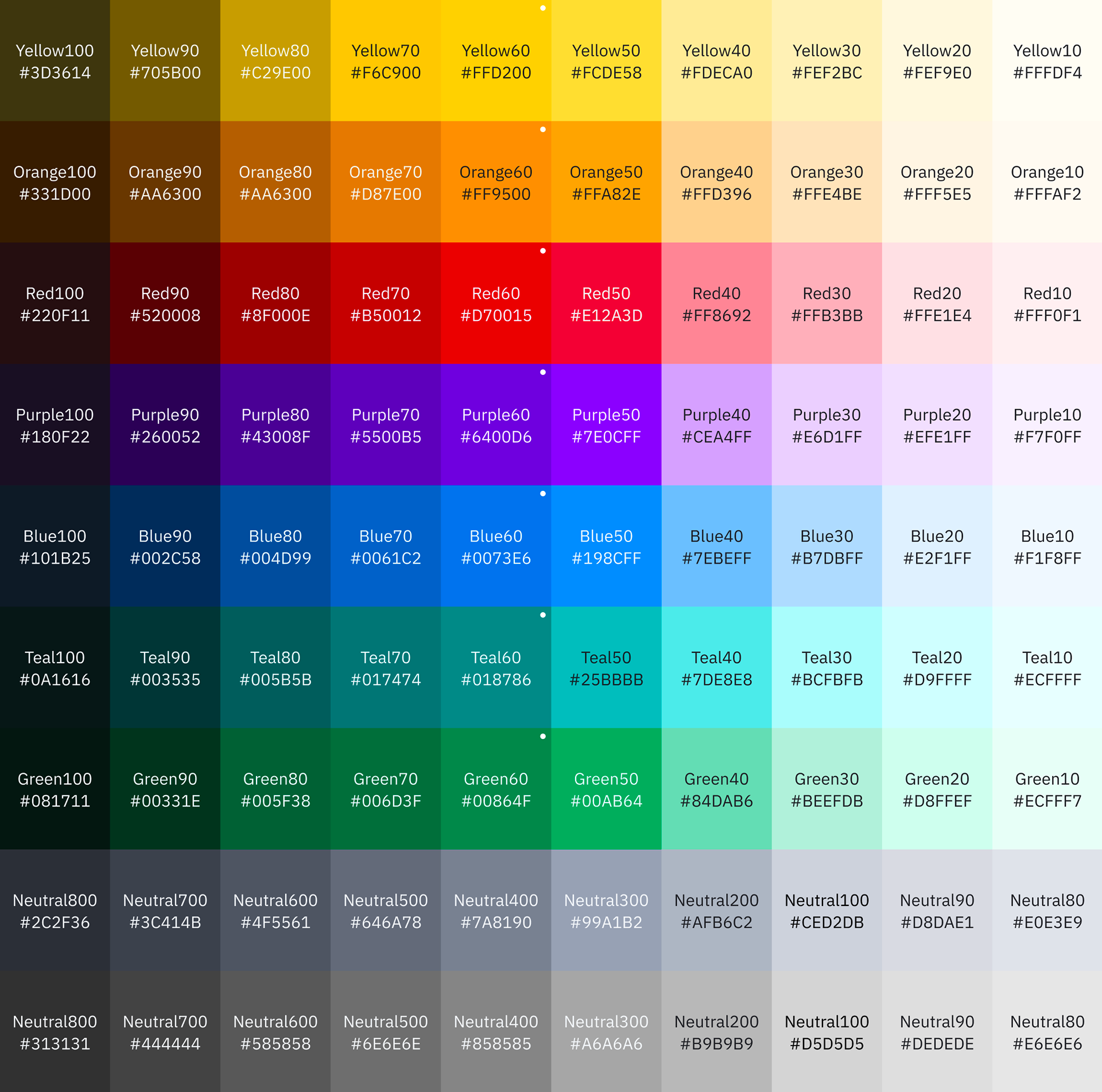
The core of the library was updated with new colors from brand guidelines and we introduced the design tokens to accelerate implementation process.
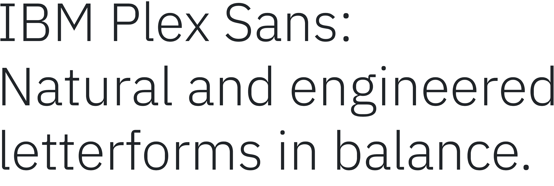
Typography :
We introduced a new typeface: IBM Plex Sans. This newly designed typeface supports multiple languages and helps Zebra differentiate itself form the apps using standard Roboto typeface from Material Design.

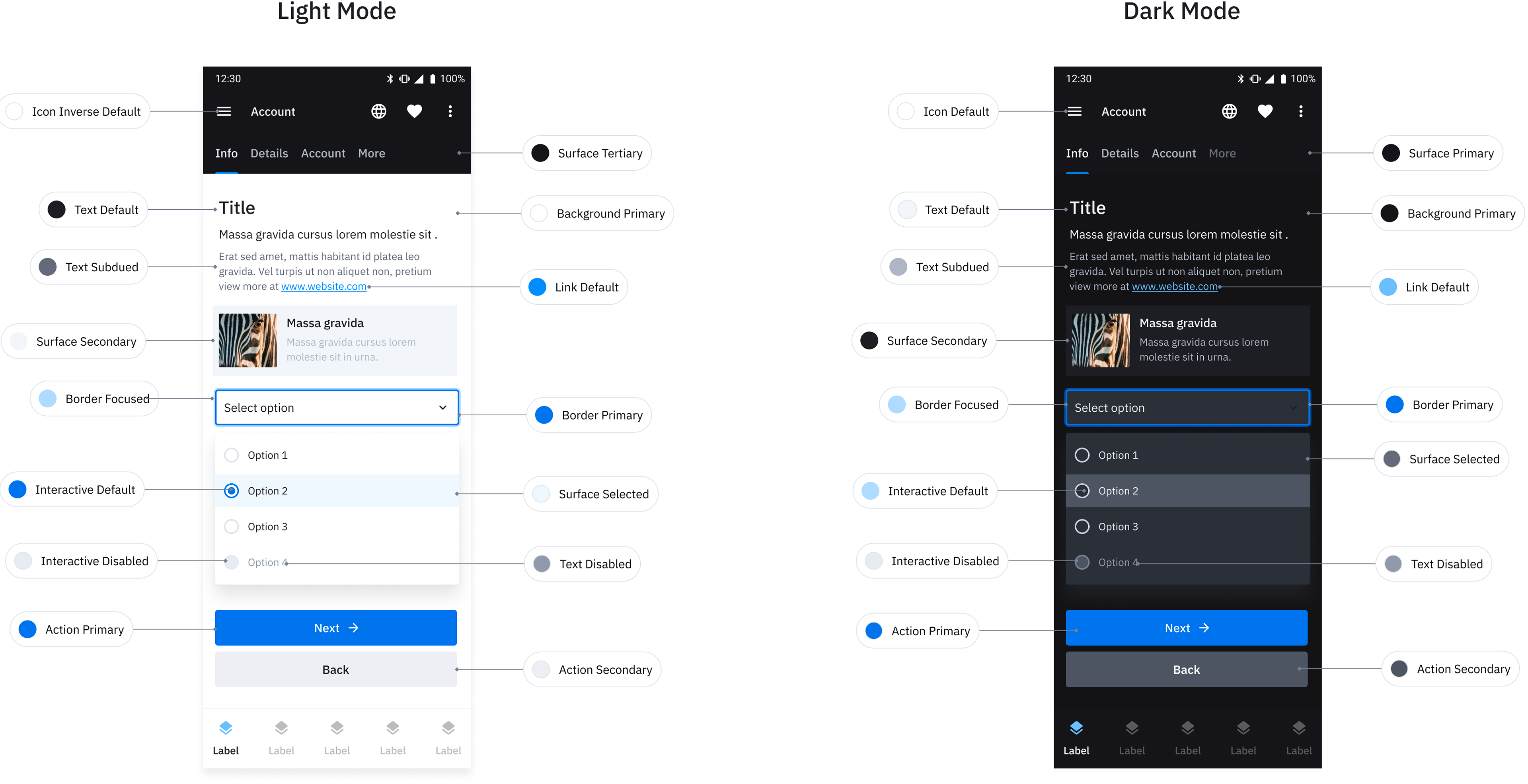
Dark Mode :
v2 supports dark mode!
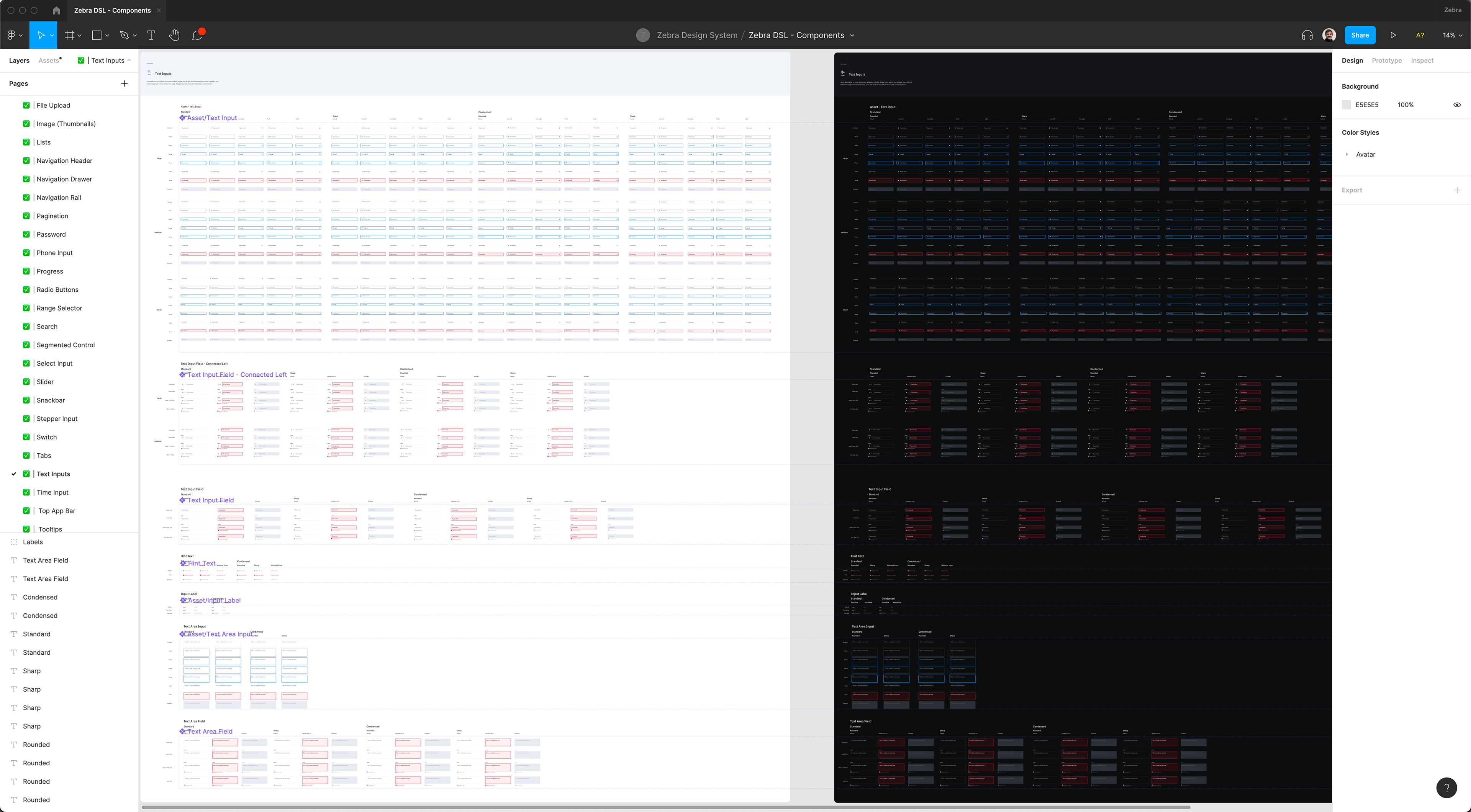
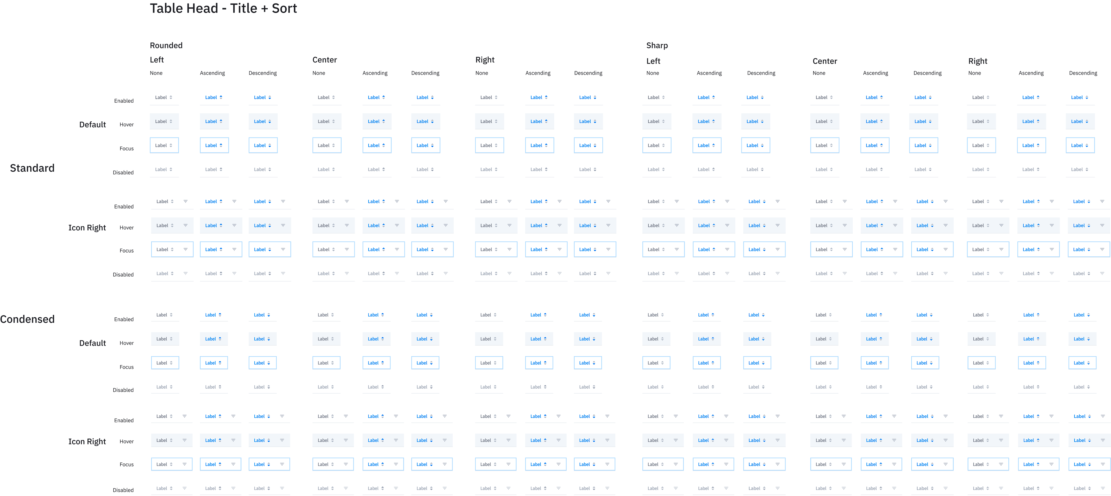
Variants :
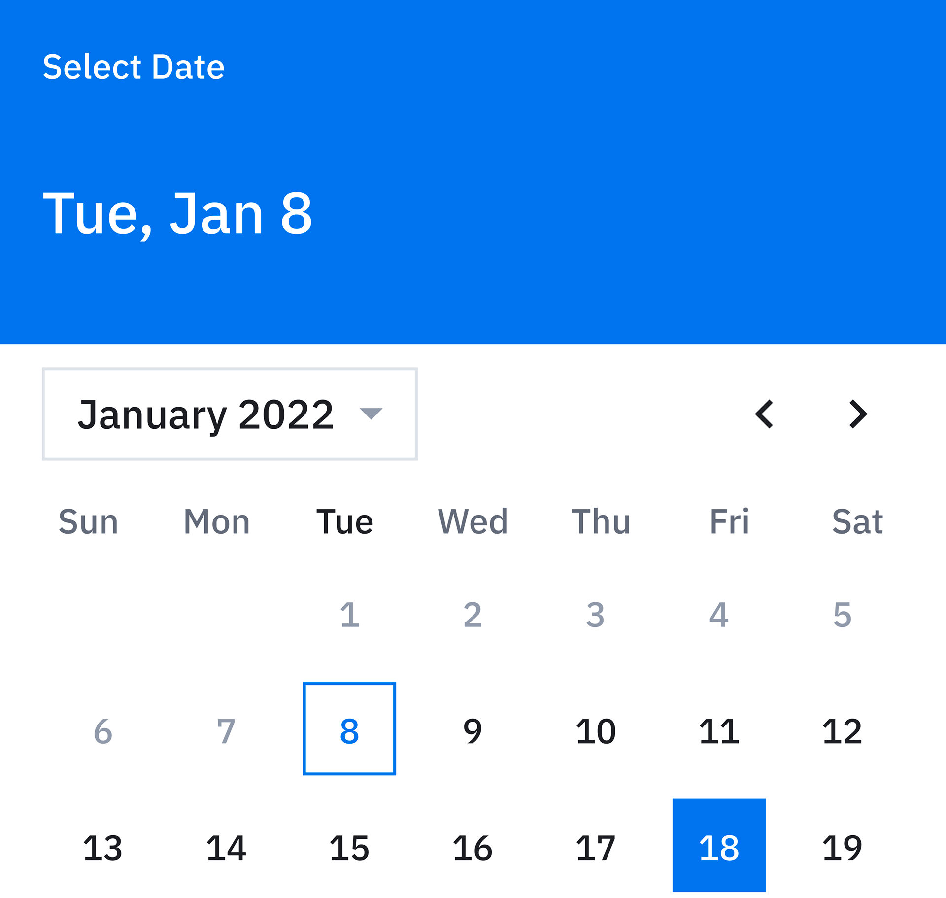
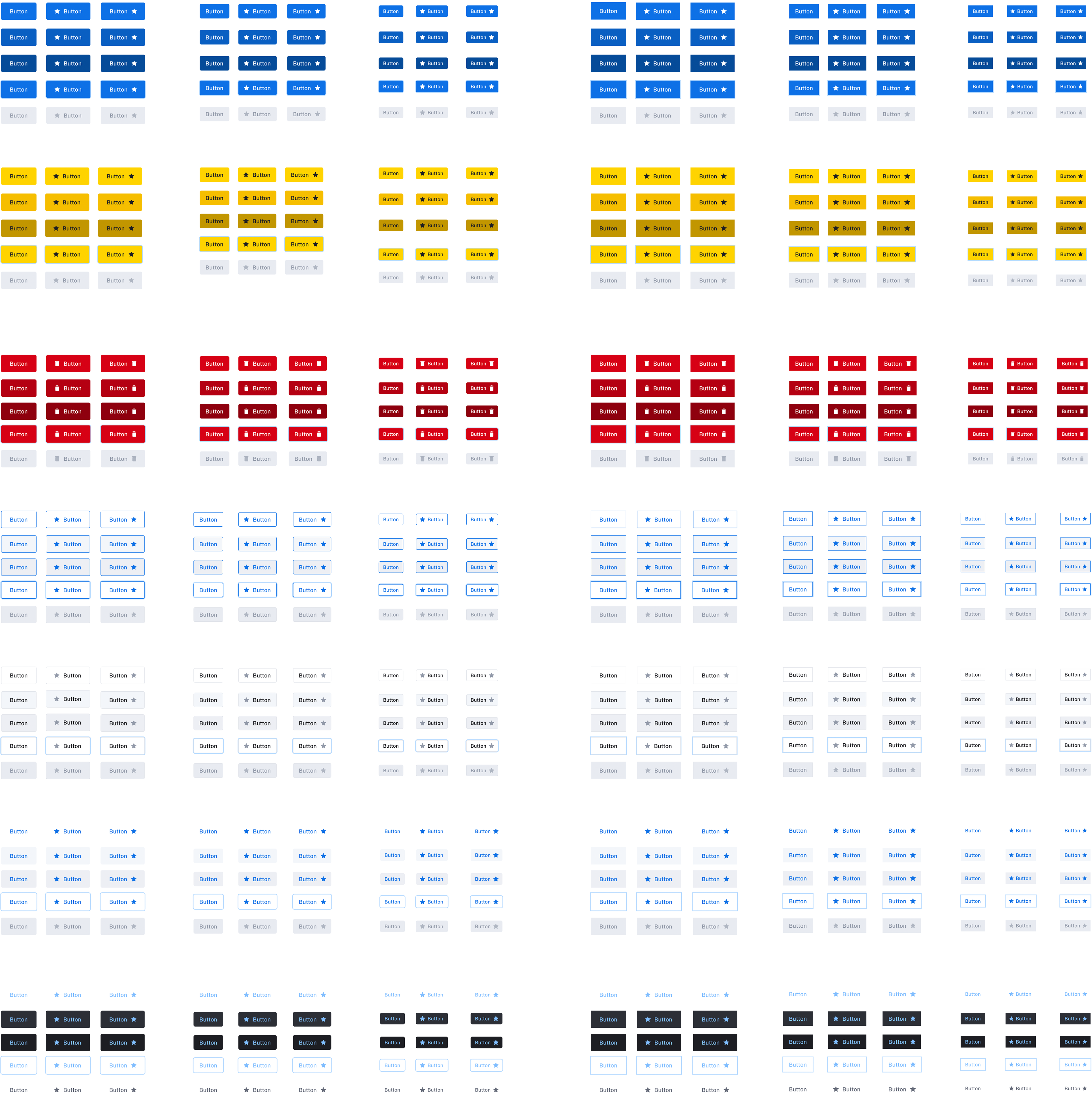
Some components needed to have more variants than others, such as text fields:
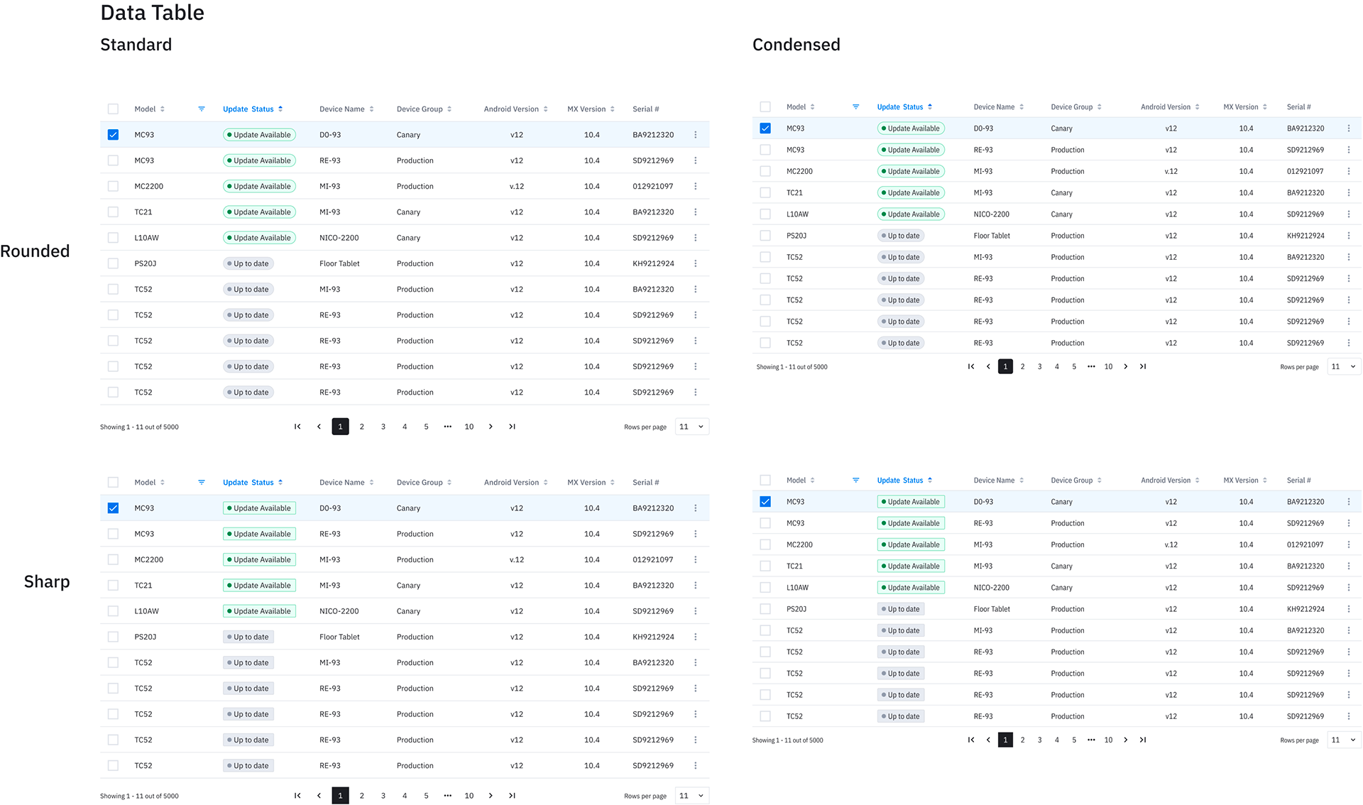
Complex components :
And some components, like tables, needed to be ready for data heavy interfaces. Many of the smaller building blocks for these complex components were created from scratch.
Moving forward :
The design is never done and we are always testing these components internally and externally to keep the library ready for new challenges and solutions.