
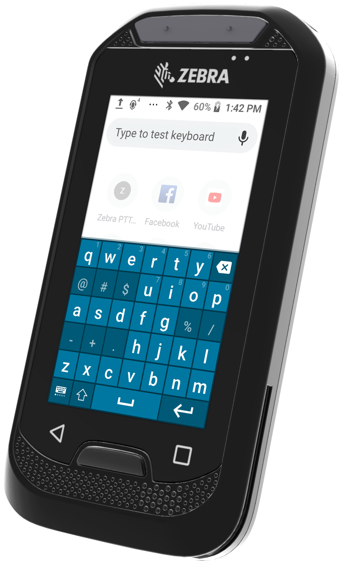
The problem:
Having a 3 inch screen on a new smart device meant that we had to redesign our components and increase the text size on all UI assets but one other problem emerged from the keyboard; we observed that the users were struggling with text entry on the tiny screen.
The solution:
I came up with the idea of breaking down the standard QWERTYUIOP layout into QWERTY, meaning that the users would have 7 keys per row instead of 10, resulting a 41% increase in touch input area for each key. I designed the new keyboard layout to test the effectiveness of it.
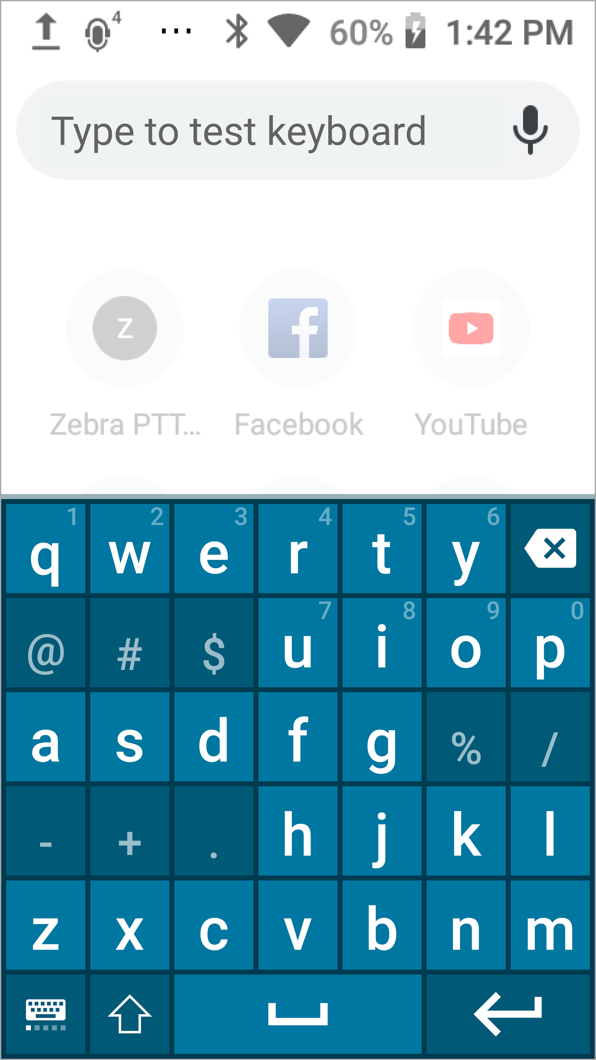
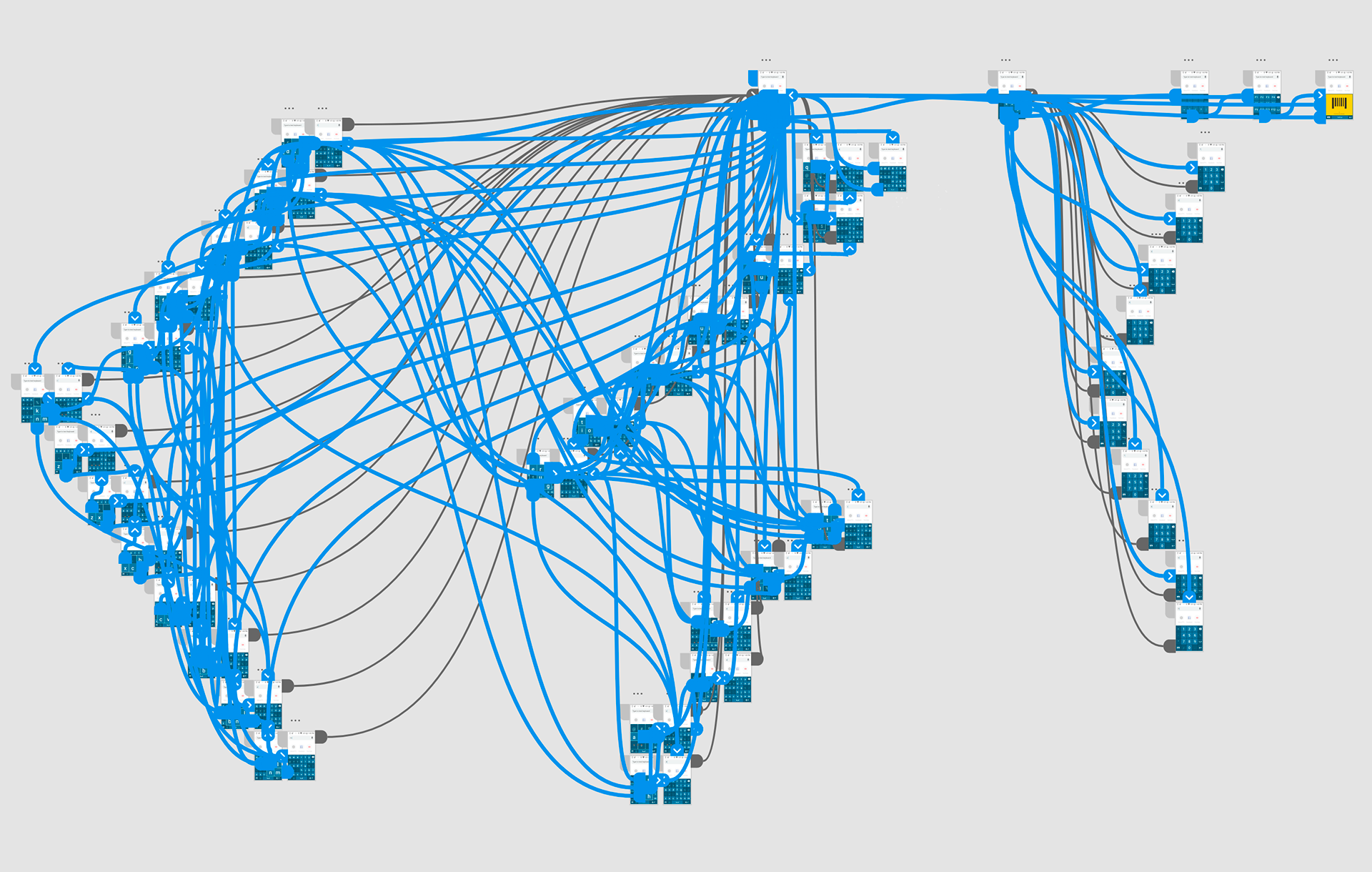
The prototype:
I made a prototype using Adobe XD, as InVision struggled with the number of artboards and failed to respond in real time. I have created all the letters and number variations to keep it as real looking as possible.
The testing:
During our internal testings, we found out that the new keyboard layout was 30% faster on average with significantly fewer errors on type input.
The impact:
With these encouraging figures, we decided to offer this keyboard as an option on the new EC30 smart device. One benefit of this new layout showed itself from the very first moments within our users; they were struggling to enter their passwords to login into the device with the standard keyboard. This new keyboard has significantly decreased the login time for our end users and ensured that the time is well spent on the critical tasks, not on input errors. We are still looking for wide audience feedback to improve the design in the future.