
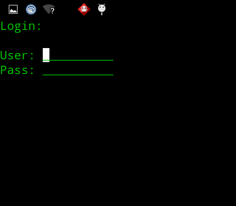
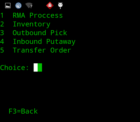
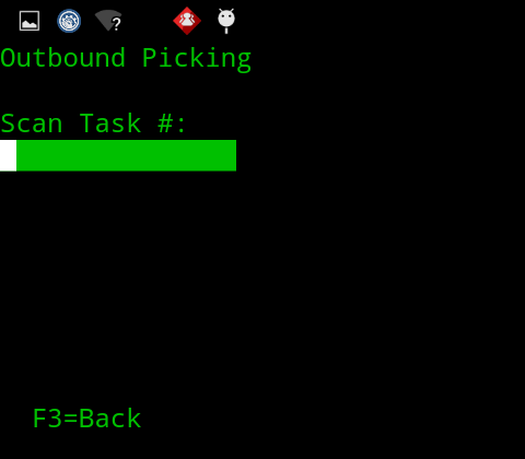
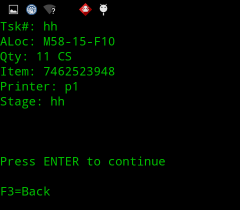
The old UI:
With a lack of graphics and green being the only available color in the UI meant that there was a huge potential to improve the user experience and increase the efficiency. Most of issues in UX were caused by lack of clarity, single color and poorly designed menu structure.
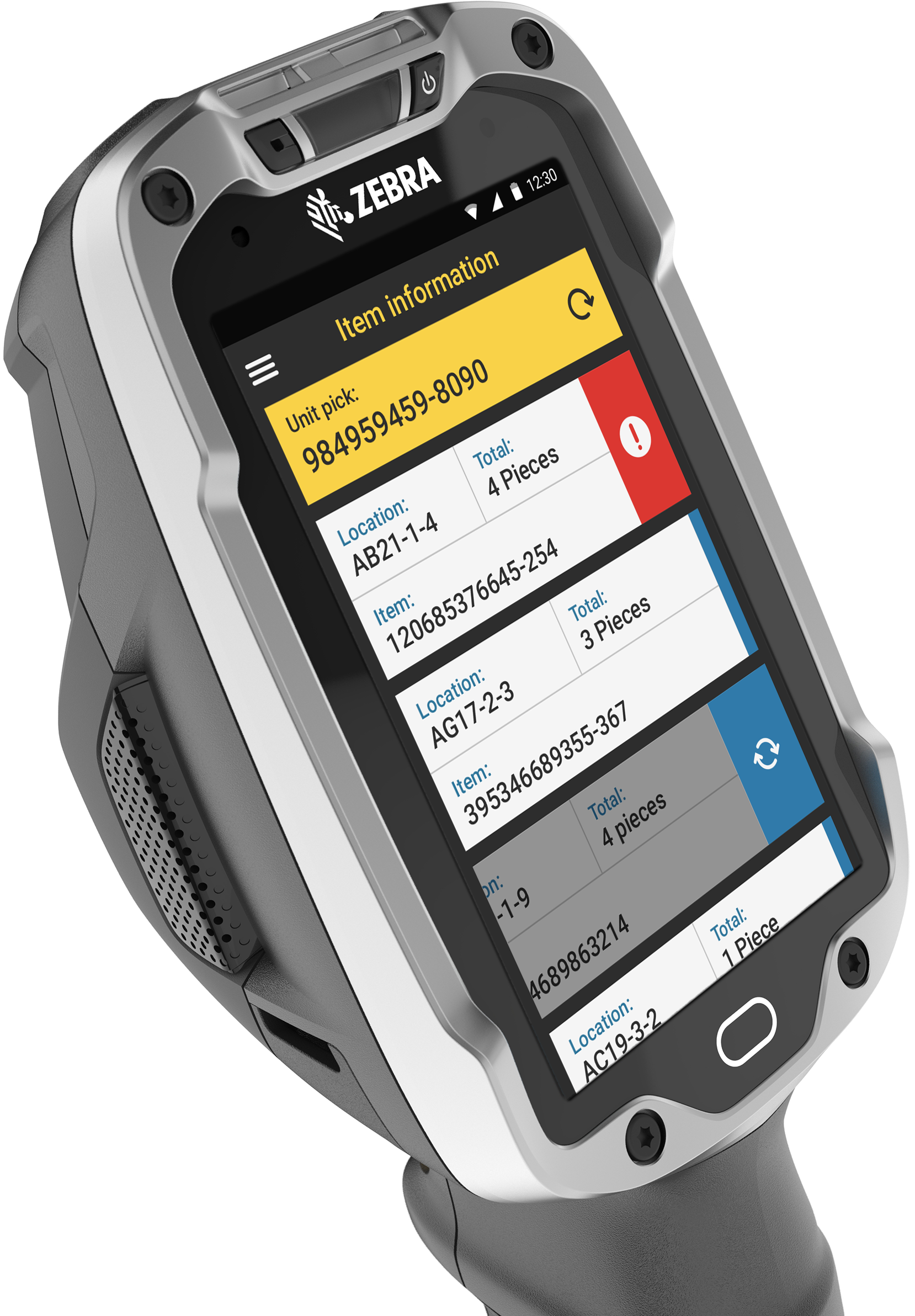
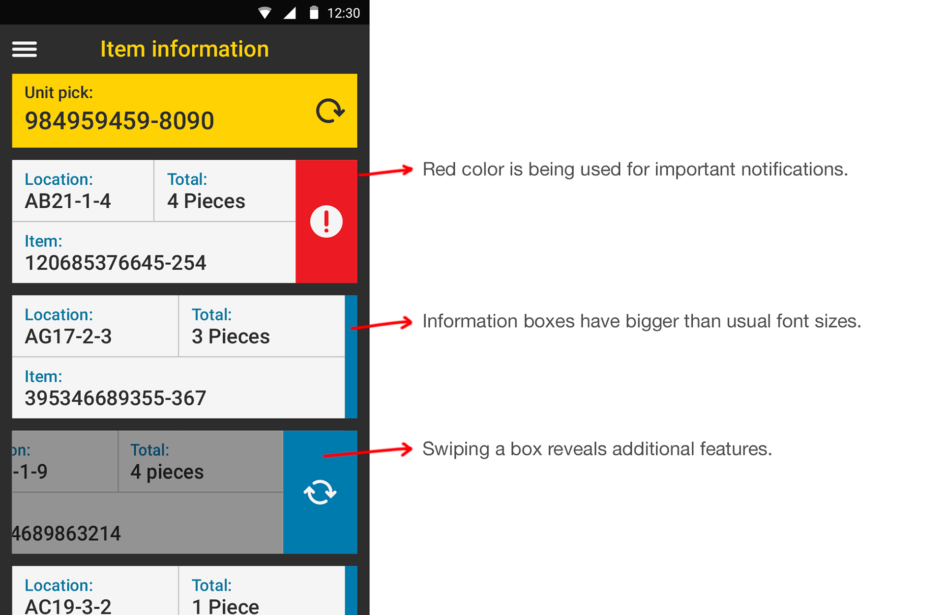
The new UI:
With all colors available to use, we were able to show errors in red color and confirmation in green, which helped users identify problems quickly. Having a touch screen also meant that we could introduce gestures, like swipes to reveal detailed information without cluttering the UI. I have designed custom components and features to reduce the error rates. These features all helped to create a better user experience for our users.
The impact:
With the TE, what used to be a 5 step process is now reduced down to a single tap, helping to increase efficiency. A standard user journey to finish a complete task on the old UI vs. the new one is now up to 20% faster on average, another significant increase in efficiency with reduced errors.