Design process:
Understanding the problem:
I made a research first in order to fully understand the voice assistant technologies and their limitations.
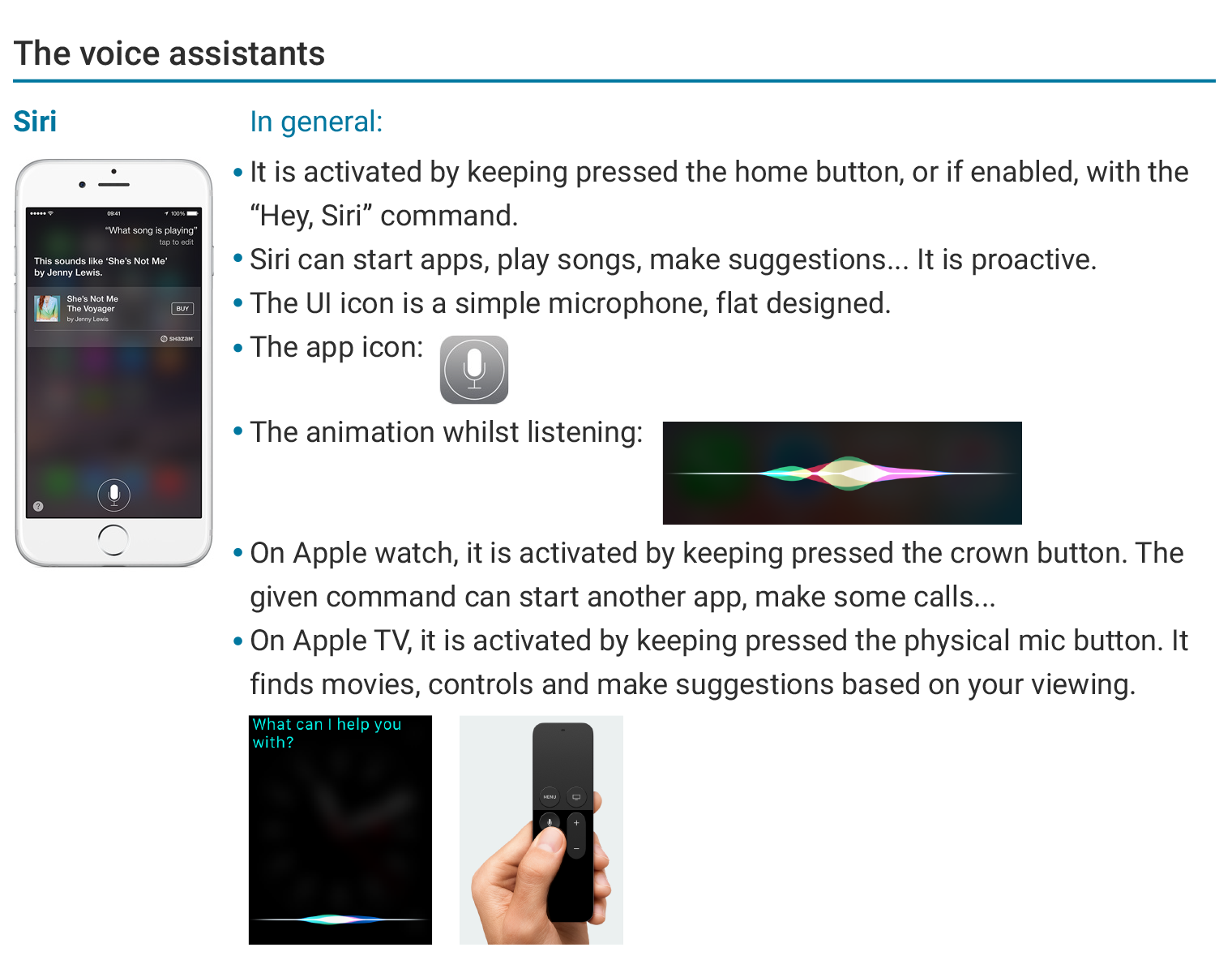
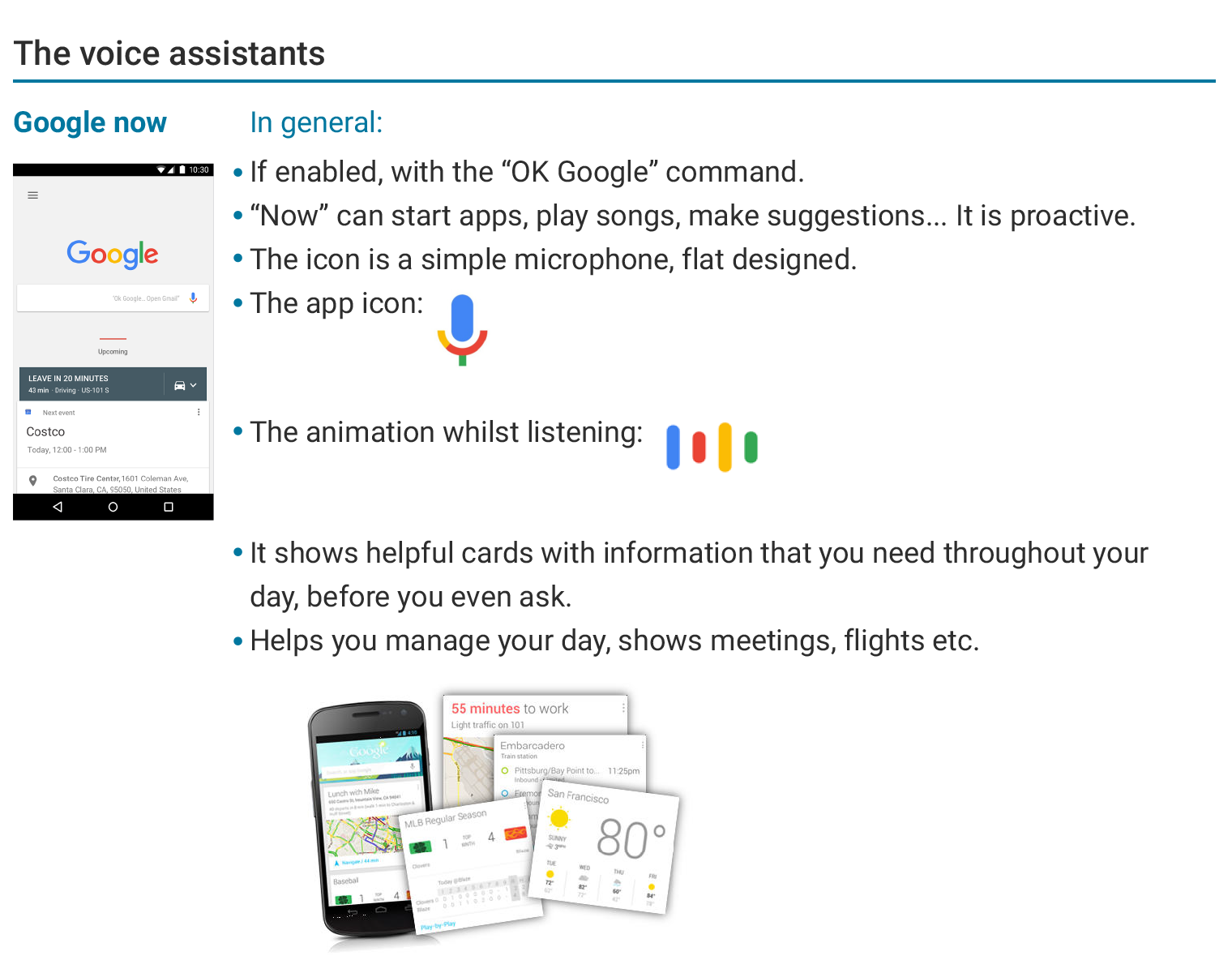
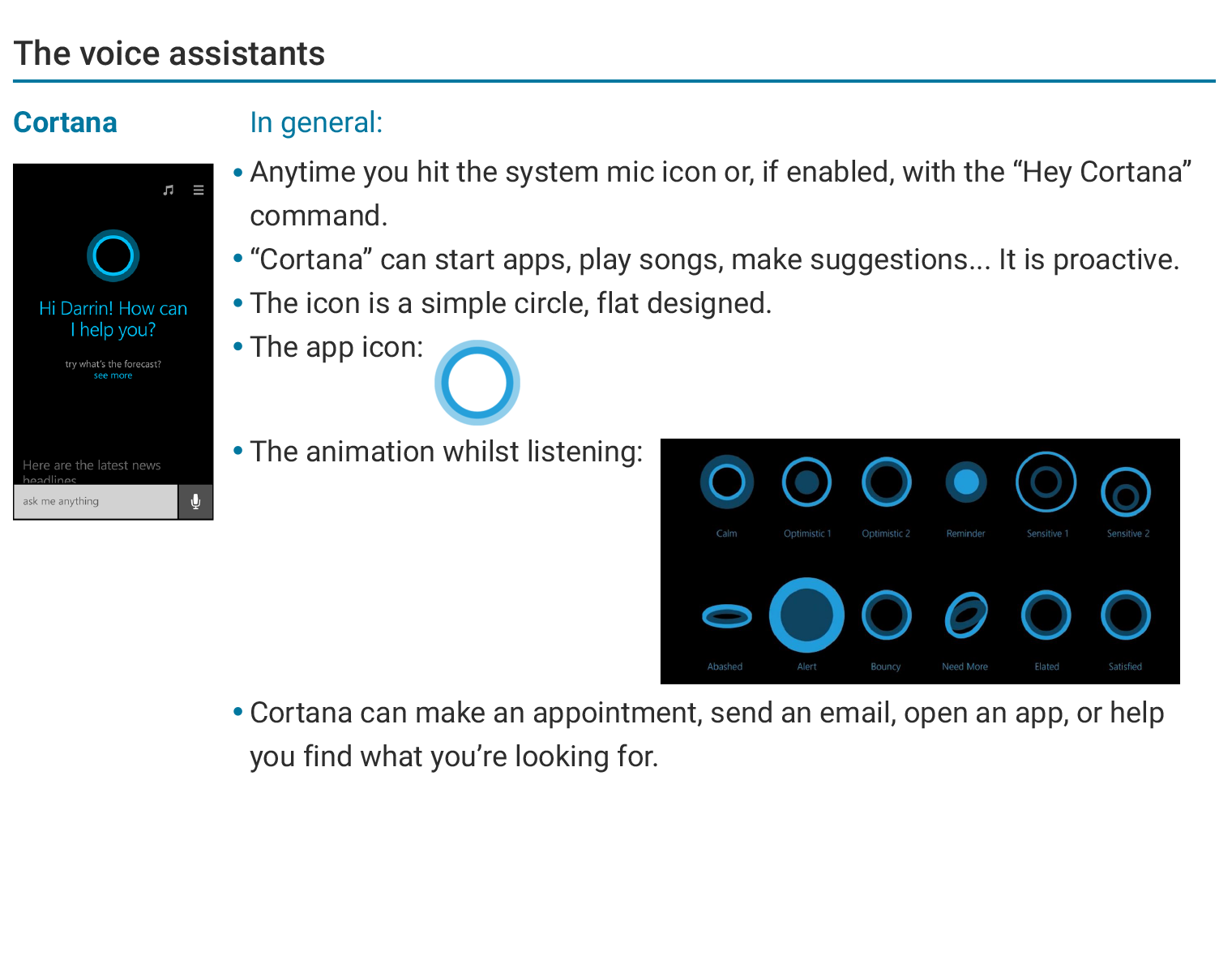
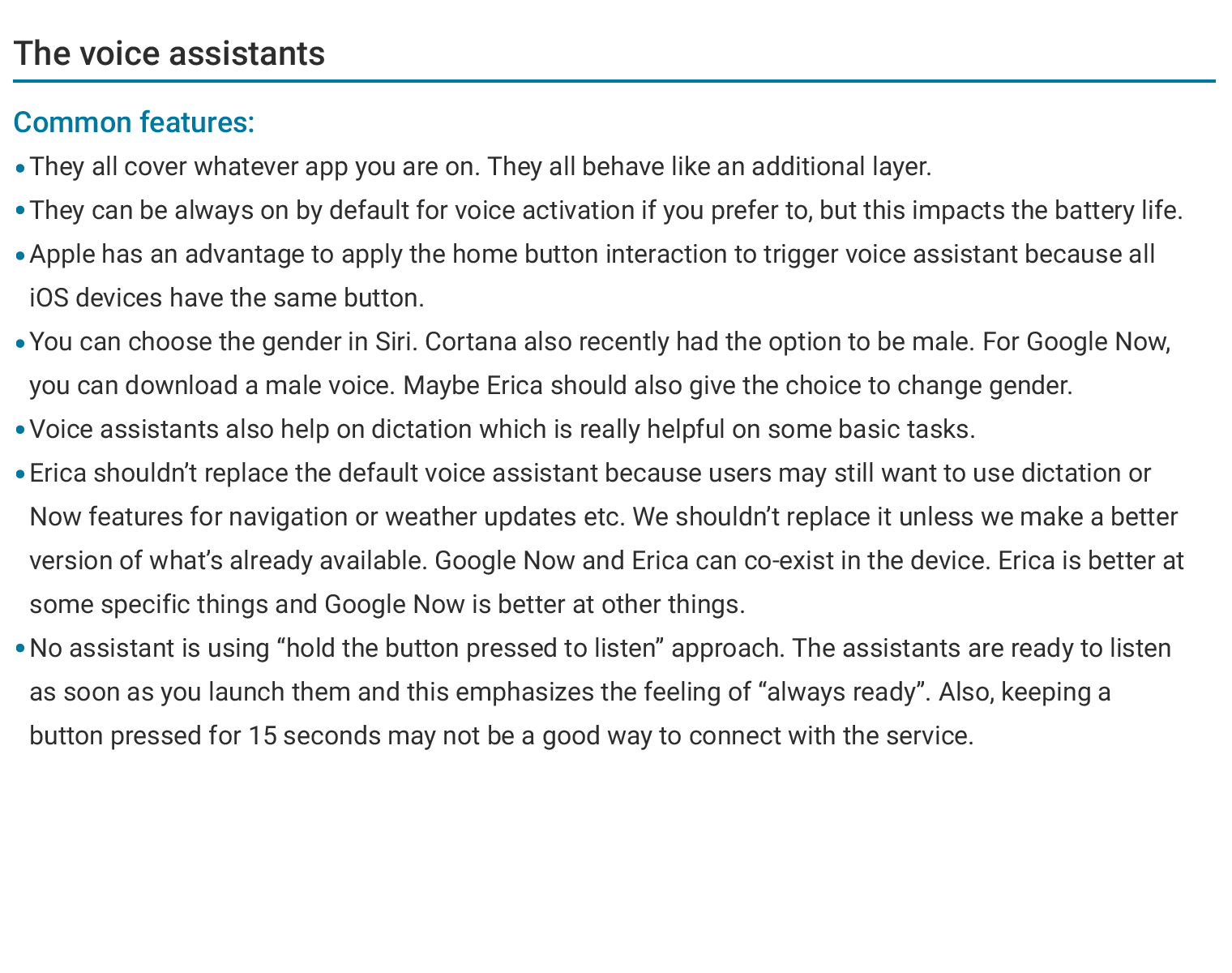
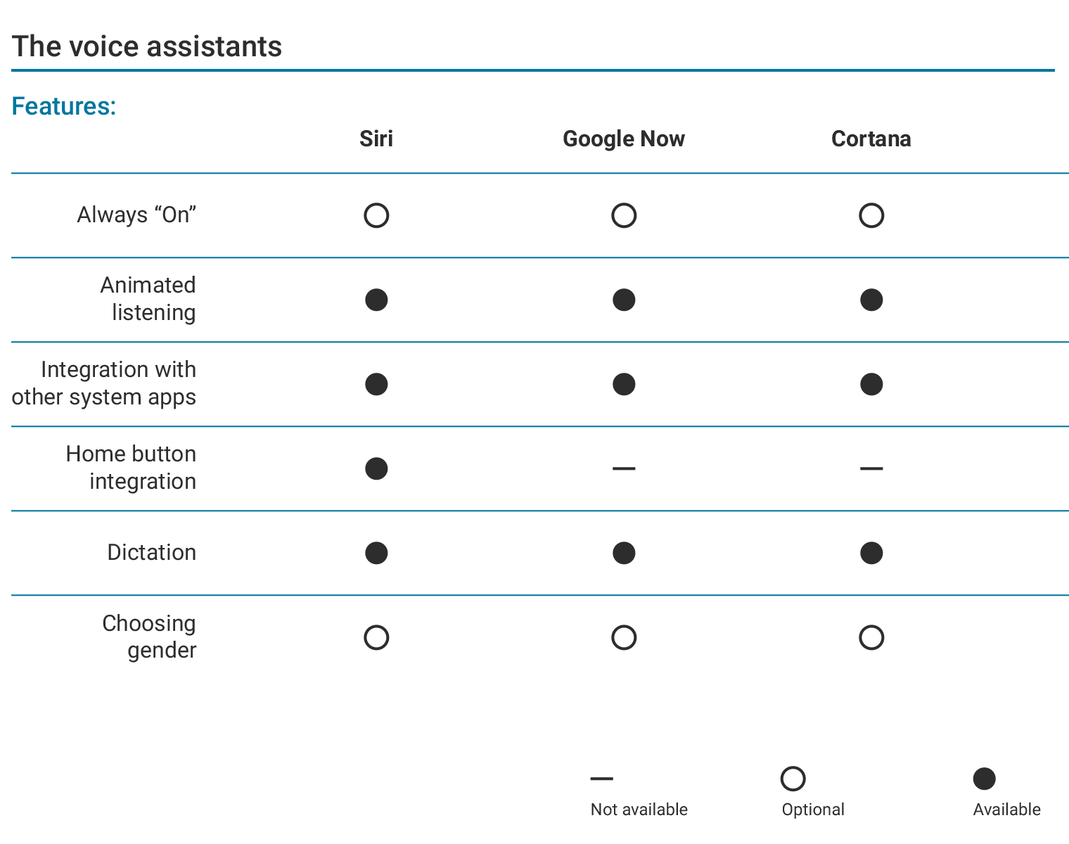
With all the insight from this research, I was able to compare all the features in the competition with requirements from the business unit. After the research, I developed a user journey map for Erica.
Ideate and sketch:
I decided to put the main button big and at the center for easy interaction. I made low fidelity screens afterwards.
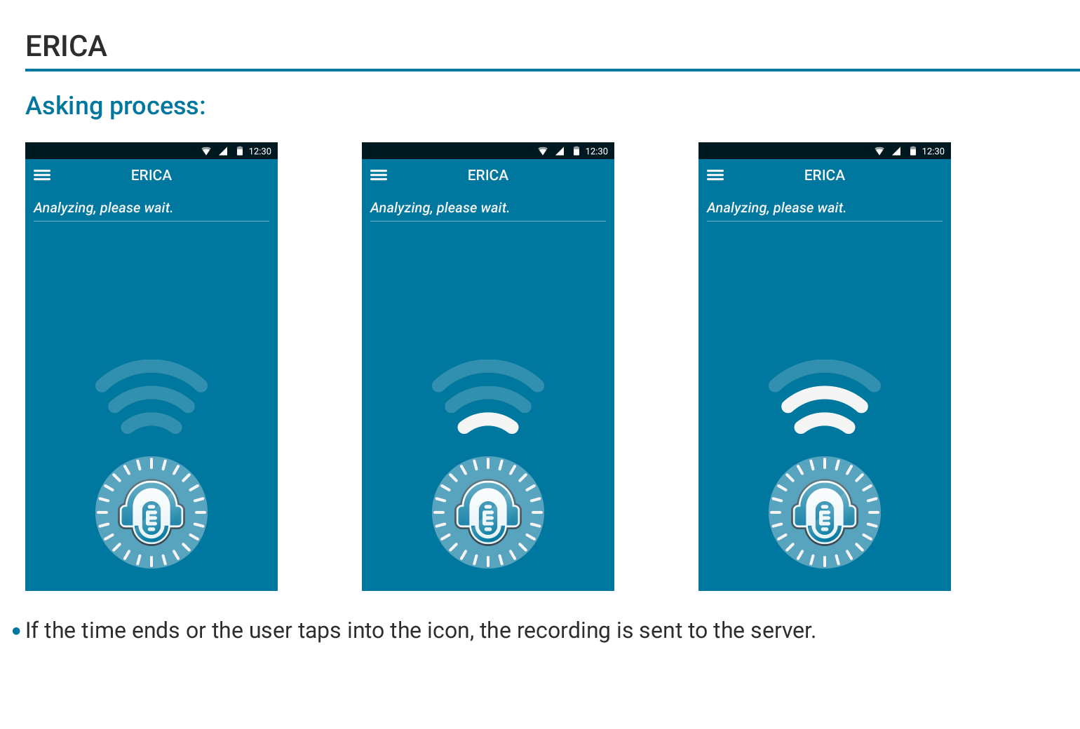
The technology we licensed (Nuance) was not responding in real time like Google Assistant so if the query was longer than 15 seconds, we had to send the recorded audio first. I kept pushing the boundaries within these technical limitations but this "record first, send later" feature shaped the interaction and the interface of the product.
Design and prototype:
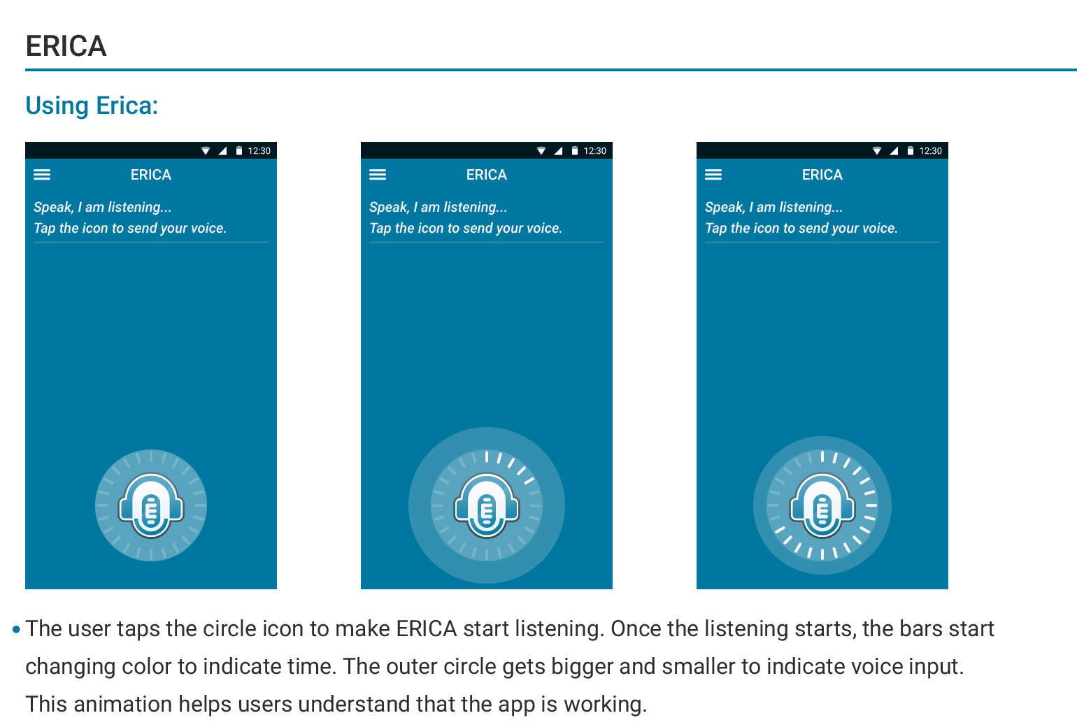
The primary design element is the recording button and I placed within thumb comfort zone. I also added a visual timer feature to show remaining time.
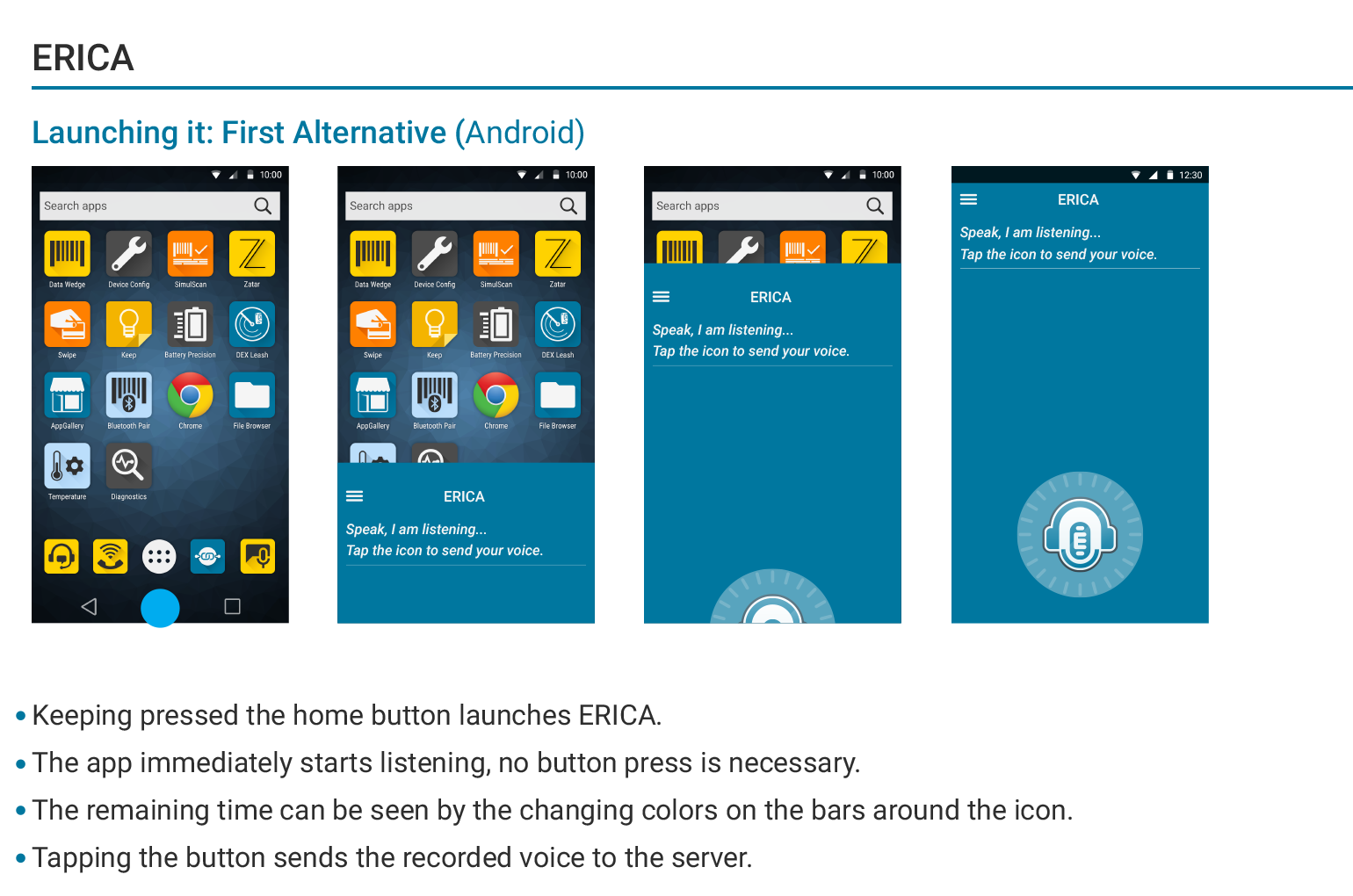
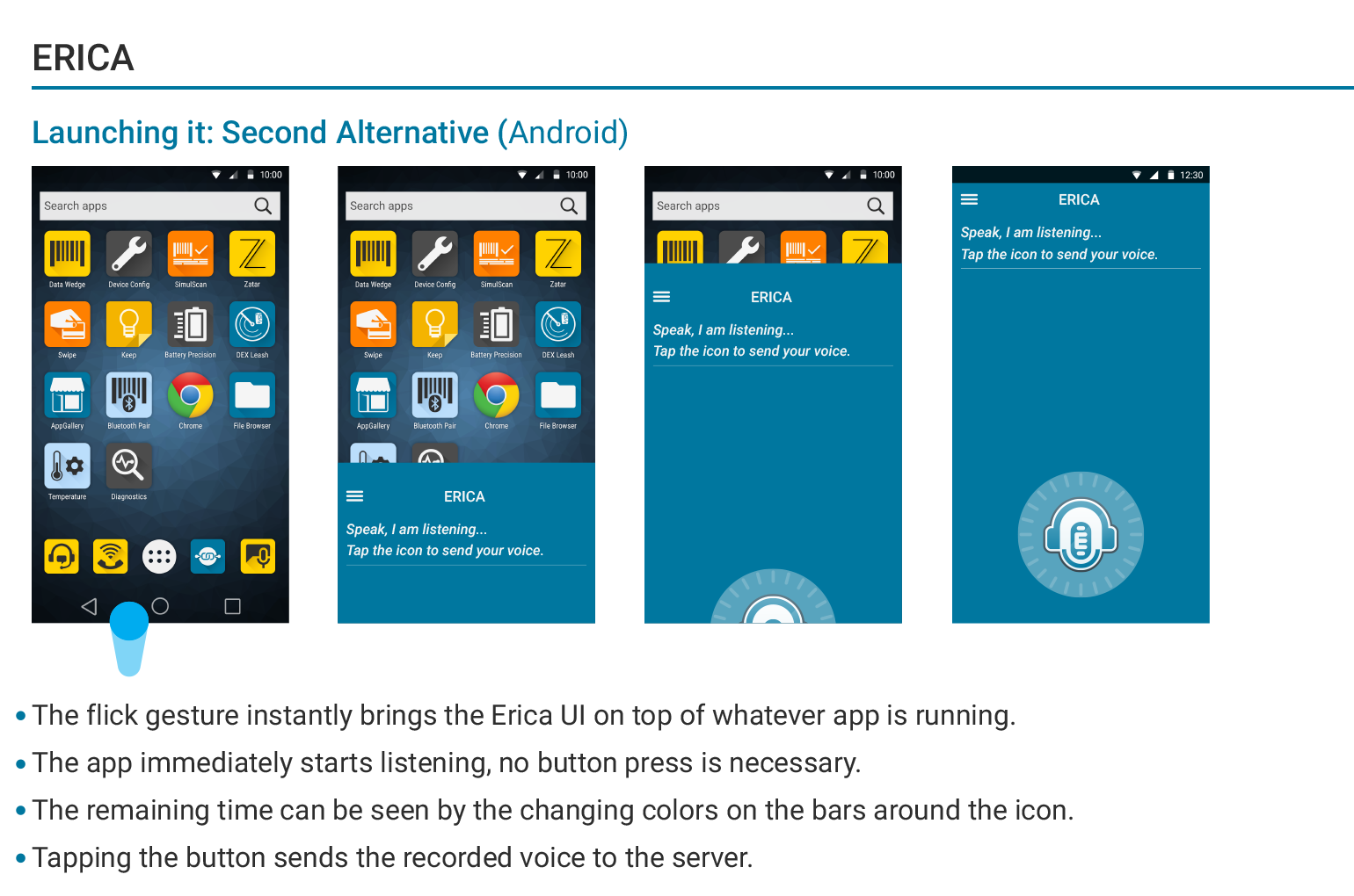
With a good understanding of what it does, I investigated how next. I explored possible ways to launch Erica without interrupting any other standard gestures available on Android devices. Here is what I found:
• Keeping the home button pressed opens up the Google Now in Android OS v5 and higher.
• Tapping the home button once or twice will make you leave the app you are working on.
• Swiping from top is revealing the notifications.
• Swiping from left or right may be confusing if the UI has a navigation drawer.
With these gestures already used by Android OS, I recommended to launch Erica from the bottom of the screen with a swipe gesture.
User journey:
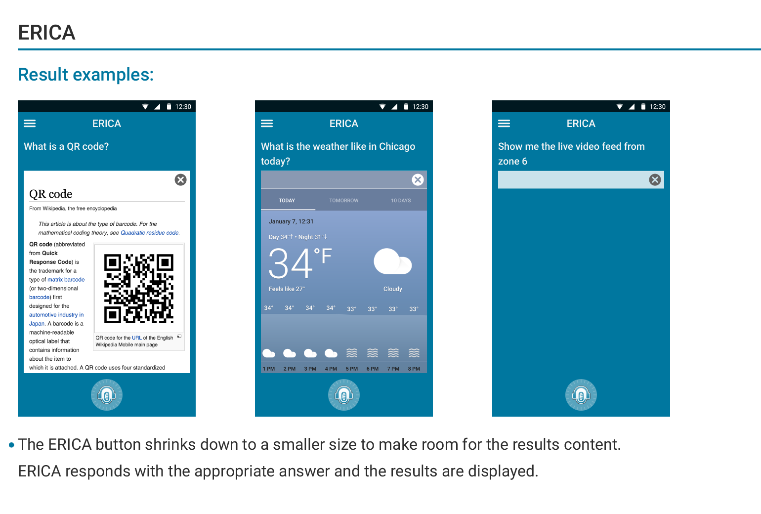
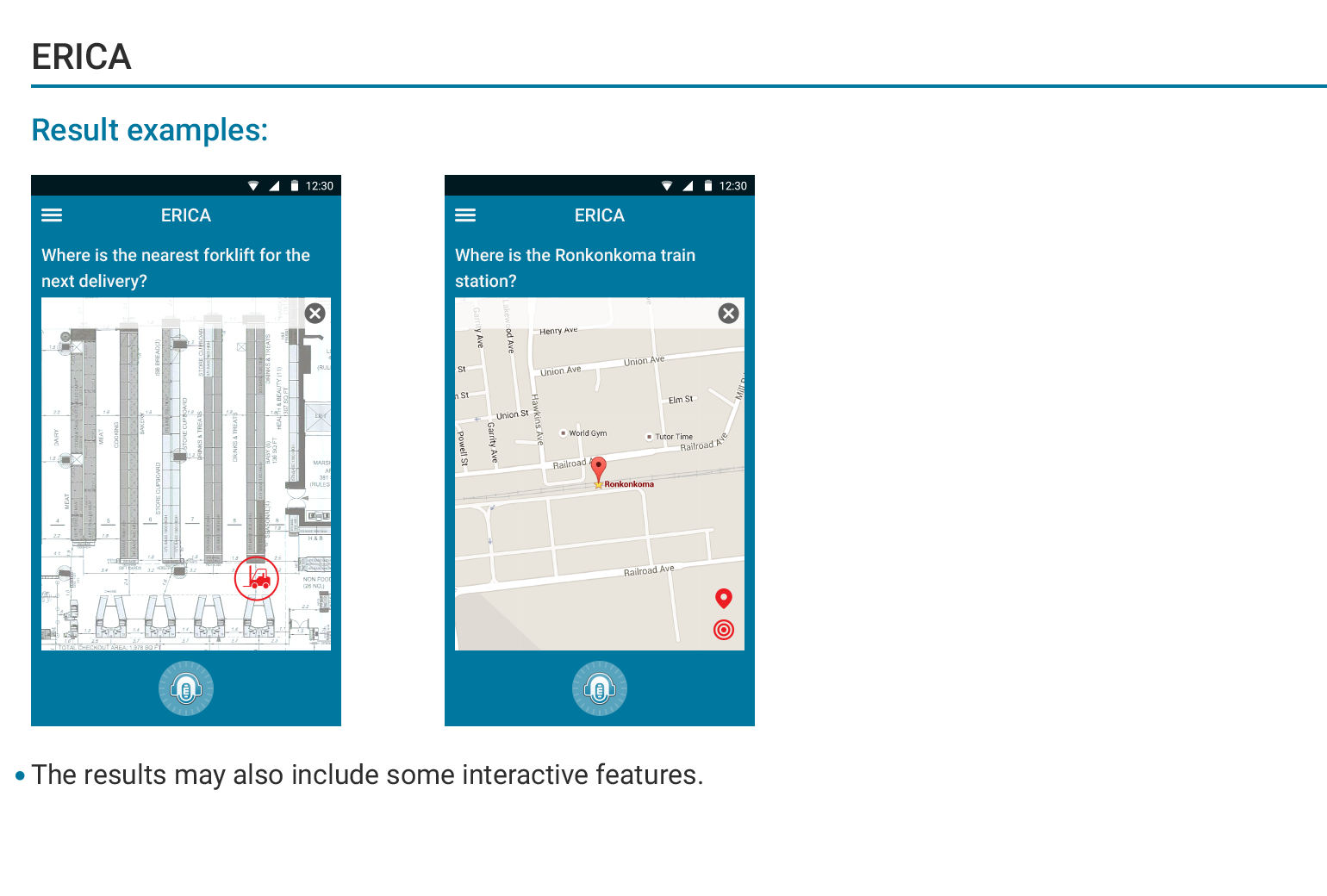
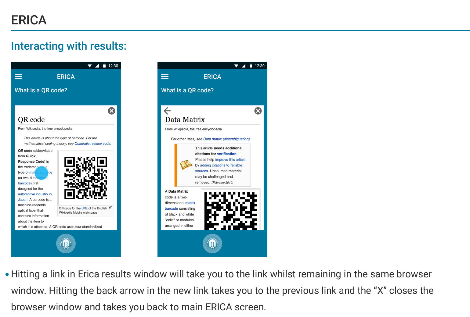
I created a basic user journey of the app explaining the available features on each step.
Feedback:
We had a soft launch of Erica with a supermarket chain, Giant Eagle in the US. The implemented feature helped employees find the location of the products in the supermarket. The major feedback we had was that they had to record their voices first in order to search for an item, which was different than what they were used to with Google Assistant. Once the recording happened, the system would help an employee but this became the biggest pain point in Erica. With this in mind we have started to look for alternative voice recognition technologies.
The impact:
Erica became a helpful assistant for various tasks during our testing period mainly for finding the location of a specific product or checking the stock levels in the distribution center. The user feedback was mainly positive and we saw a 8% increase in finding the location of a specific product at a Giant Eagle warehouse.
